
Painters love options until options start painting back.
A table crowded with tubes can feel inspiring for about five minutes. Then the second-guessing begins. Is the shadow too violet? Does that cheek need more orange? Should the background lean cooler, greener, grayer? A limited set of pigments cuts through that noise. That is part of the lasting appeal of the Zorn palette: it gives you fewer choices, but better ones.
Named after Anders Zorn, the celebrated Swedish artist known for his astonishing portraits, figure paintings, and luminous handling of flesh tones, this classic palette has become a rite of passage for many artists. It is simple enough for beginners to understand and sophisticated enough to keep advanced painters honest. In a studio setting, it trains the eye to notice what matters most: value, temperature, edges, and relationships.
At Atelier School of Art, where drawing and painting are taught with close attention to observation and craft, this kind of disciplined approach makes real sense. Whether you are painting a self portrait, working from life, or trying to understand why some portrait paintings feel unified while others fall apart, the Zorn limited palette offers a practical framework. It is less about nostalgia and more about seeing clearly.
What Is the Zorn Palette?
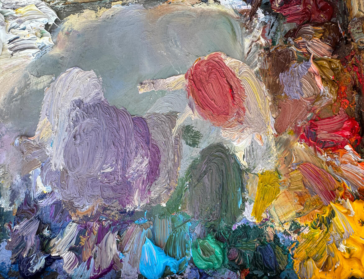
The Zorn palette is a classic limited palette associated with Anders Zorn and his portrait work. Traditionally, it uses four colours: yellow ochre, cadmium red, ivory black, and white. Historically, lead white would have been common, but many contemporary painters substitute titanium white for safety and availability.
That sounds almost too spare to be useful. No obvious blue. No vivid green. No lineup of primary colours. Yet this restricted palette can produce an impressive range of natural skin tones, colorful browns, grays, muted oranges, soft violets, and even sensitive greens under the right conditions. The key is understanding that ivory black often behaves like a cool blue in mixtures, especially when paired with white and yellow ochre.
This is why the Zorn palette keeps showing up in studios, workshops, and portrait classes. It appears limited on paper, but on the canvas it opens up a surprising amount of subtlety. Many artists get the wrong impression that only four colors means dull results. In practice, the opposite often happens. With fewer pigments competing for attention, the painting can feel more coherent, more believable, and more alive.
The Classic Zorn Palette Colors
The standard Zorn palette colors are yellow ochre, cadmium red, ivory black, and white. These four colours each play a distinct role, and the magic comes from their relationships rather than their individual drama.
Yellow ochre is the earthy anchor. It brings a muted warmth that keeps mixtures grounded and natural. Compared with a brighter yellow like cadmium yellow or lemon yellow, yellow ochre has an inherently lower chroma, which is exactly why it works so well in portrait paintings. It does not shout. It glows quietly.
Cadmium red supplies warmth, body, and the heat needed for skin, fabric, accents, and lively middle values. Depending on the painter, this may be cadmium red light or a close modern equivalent. Some contemporary versions of the modern Zorn limited palette use permanent bright red instead of traditional cadmium red, either for preference, cost, or concerns about toxic alternatives.
Ivory black is the most misunderstood pigment in the set. In a black and white context, it reads simply as black. In the Zorn limited palette, though, ivory black often functions like a low-chroma blue. Mixed with titanium white, it can create cool passages that suggest blue sky light or cool planes in flesh. Mixed with yellow ochre, it can generate greenish notes that are excellent for subdued backgrounds and sensitive greens.
White, whether lead white historically or titanium white in most modern studios, controls value and opacity. Titanium white is brighter and cooler than lead white, so some painters note that a cooler titanium white changes the feel of mixtures slightly. Still, it remains the practical studio standard for many artists working in oil paint today.
Anders Zorn and Why This Palette Still Matters
Anders Zorn was not famous because he used a clever trick. He was famous because he could make paint breathe. His portraits, nudes, and self portrait studies show extraordinary command over value pattern, edge control, and color economy. The Zorn palette did not limit him; it clarified his decisions.
When people study Zorn’s paintings, they often notice two things at once. First, the work feels restrained. Second, it feels rich. That pairing is exactly the lesson. A painting does not need every hue available on the shelf to feel complete. It needs a strong structure and a palette that supports it.
In the art world, many artists eventually swing back toward some form of restricted palette after experimenting with dozens of pigments. They discover that endless mixing possibilities are only useful if the painter understands what to do with them. Anders Zorn shows that control can create freedom. His example still matters because the challenge has not changed: organize light, simplify color, and make the figure feel present.
Why a Limited Palette Makes Painters Better
A limited palette is not just a historical curiosity. It is a training tool. It teaches you to stop decorating the canvas with random color and start building a painting through relationships.
When students work with too many pigments too early, they can hide weak drawing and weak value under flashy mixtures. The Zorn palette removes that escape hatch. If the head turns on the canvas, it turns because the values are right. If the cheek feels warm against the jaw, it is because the temperature shift is clear. If the whole painting hangs together, it is because the palette itself encourages harmony.
That is why a Zorn palette study can be so revealing. It shows you what your eye is actually doing. Are you seeing light accurately? Are you overmixing? Are you chasing hue when the real problem is value? A limited palette gives immediate feedback, and that feedback is often more useful than another expensive tube of paint.
Value Control: The Real Backbone of the Zorn Palette
The biggest gift of the Zorn palette is value control. Before color can sing, light and dark have to be organized. Anders Zorn understood this deeply. His paintings work because the value pattern is strong enough to carry the image even before you admire the color.
With yellow ochre, cadmium red, ivory black, and titanium white, you can build a wide range of values without getting distracted by high-chroma pigments. You begin to think in terms of light family and shadow family. You compare middle values more carefully. You notice that one forehead plane is lighter, but not necessarily warmer, than the next. That kind of seeing is the foundation of good painting.
Try squinting at your subject before you mix. Reduce the scene to a handful of major shapes. Then use the palette to match those shapes by value first. This is where the apparent simplicity of four colours becomes powerful. It slows you down in the best way. Instead of reaching for another tube, you learn to mix with intention.
Harmony Comes Built In
One reason the Zorn palette feels so satisfying is that harmony is almost baked into it. Because all the mixtures come from the same small family of pigments, the resulting color relationships naturally belong together.
This does not mean every painting looks the same. It means the painting has a shared language. A cheek note made from cadmium red, yellow ochre, and titanium white will relate beautifully to a background gray made from ivory black, yellow ochre, and white. Even when the hue shifts, the pigments echo each other.
That matters in portrait paintings, where one discordant mixture can break the illusion of life. Natural skin tones depend less on isolated “correct” colors and more on transitions. The Zorn palette is excellent at transitions. It helps painters create believable flesh tones that move gradually from warm to cool, from light to half-tone, from reflected light into shadow.
Confident Colour Mixing With Fewer Pigments
There is a special kind of confidence that comes from knowing your palette intimately. Not guessing. Knowing.
With a larger color palette, colour mixing can become a messy negotiation among too many personalities. With the Zorn limited palette, each pigment has a clear job. Yellow ochre warms and earths. Cadmium red energizes. Ivory black cools and deepens. Titanium white opens the value range and shifts opacity. Because the ingredients are few, the painter starts to predict outcomes more reliably.
This is especially helpful for beginners, but it is not only for beginners. Experienced painters also benefit from the discipline. Mixing yellow ochre with ivory black can produce a green that is muted but useful. Add more white and it softens into atmospheric notes. Mix cadmium red with ivory black and you can get deep maroons, dark neutral passages, and shadow notes with surprising elegance. Combine all four colours and you can arrive at colorful browns that feel complex without becoming muddy.
The result is not less color but smarter color. The Zorn palette teaches you that a hue does not need to be loud to be convincing.
How the Zorn Palette Handles Flesh Tones
If the Zorn palette has a home territory, it is flesh tones. That is one reason it remains so closely tied to Anders Zorn. He could suggest warm blood under skin, cool turning planes, and luminous effects with very little. The palette excels at believable flesh tones because it lives in the same earthy, moderated range that skin often occupies.
Start with yellow ochre, cadmium red, and titanium white for a basic light skin mixture. Then adjust. More yellow ochre gives an earthy warmth. More cadmium red introduces blush and heat. A touch of ivory black cools and neutralizes the mixture, helping you avoid the candy-pink trap that ruins many beginner portraits.
For shadow areas, ivory black and cadmium red can establish a warm, deep base, while yellow ochre can shift the mix toward olive or muted warmth. This is where natural skin tones emerge through subtle shifts rather than obvious formulas. Skin tones are never one flat color. They bend, cool, flush, gray out, and reflect nearby surfaces. The Zorn palette is especially good at those transitions.
Painters working on a self portrait often discover this quickly. The nose may need more cadmium red. The temple may lean cooler. The neck may require more yellow ochre and black to sit back. Because the palette is consistent, those changes remain related. That unity is what gives convincing flesh tones their authority.
Can the Zorn Palette Make Green and Blue?
Yes, though not in the way a full palette does.
A classic question about the Zorn palette is how it can function without an obvious blue tube. The answer is that ivory black often stands in for blue, especially in mixtures with white. It is not a saturated blue, but saturation is not always what a painting needs. In many portrait and figure contexts, a subdued cool note is more useful than a flashy one.
Mix yellow ochre with ivory black and you can get greenish notes suitable for backgrounds, fabric, or reflected light. These are not spring-meadow greens. They are sensitive greens, the kind you might actually want behind a face or in a quiet interior. If you need stronger blue passages, some painters adapt the modern Zorn limited palette with prussian blue. Others experiment with mars black instead of ivory black, though mars black behaves differently and usually does not replace blue in the same way.
This is where the modern Zorn limited palette enters the conversation. Some teachers keep the four colours intact. Others allow small updates, such as adding permanent bright red, cadmium red light, or prussian blue for specific goals. Those adaptations can be useful, but the discipline of the original setup remains the point.
The Modern Zorn Limited Palette in Today’s Studio
The modern Zorn limited palette usually keeps the spirit of the original while adjusting for modern synthetic pigments, safety preferences, and product availability. Instead of lead white, artists commonly use titanium white. Instead of historical reds, they may use cadmium red light or permanent bright red. In some cases, painters compare night black, ivory black, and mars black to find the handling they prefer.
There is no need to become doctrinaire about it. The goal is not reenactment. The goal is learning. If adding permanent bright red helps you get cleaner warm notes, that may suit your process. If your instructor prefers titanium white over lead white, that is a practical studio decision. If you occasionally add prussian blue for a cooler note in a background, that does not erase the value of studying the Zorn palette.
Still, it helps to spend serious time with the classic four colours before introducing other colours. Otherwise, the lesson gets diluted. The power of the Zorn limited palette lies in its constraints. The less room you have to hide, the faster your eye develops.
A Practical Way to Set Up Your Palette
Set out small, clean piles of titanium white, yellow ochre, cadmium red, and ivory black on your palette. Keep the arrangement consistent each session. That may sound minor, but painting is full of tiny habits that reduce friction and sharpen concentration.
Before you begin the actual painting, make a short value string or color chart. Mix yellow ochre with white in several steps. Mix ivory black with white in several steps. Then combine yellow ochre and ivory black to see your green range. Test cadmium red with white, then with black, then with yellow ochre. This is not busywork. It is how you learn the actual behavior of your pigments, including opacity, semi transparency, tinting strength, and how the pigment particles affect the surface.
On the canvas, block in large shapes first. Think broadly about light and shadow. Use thinner oil paint at the start if that suits your process, then build more body as the painting develops. Do not chase tiny color events too early. The Zorn palette rewards patience.
Common Mistakes Painters Make With the Zorn Palette
One common mistake is assuming the palette is so simple that the painting will take care of itself. It will not. In fact, a limited palette exposes weak observation very quickly. If your drawing is off or your values are compressed, the result can look chalky or dead.
Another mistake is overusing white. Because titanium white is powerful, it can cool and flatten mixtures if added carelessly. Some painters accustomed to lead white find titanium more abrupt. It helps to add it gradually and compare every mixture against the subject, not just against the pile on the palette.
A third mistake is expecting bright local color where the palette is designed for moderation. If you want intense citrus yellow, use lemon yellow or cadmium yellow in another exercise. If you want fiery blue fabric, use a broader palette. The Zorn palette is not for every subject under every condition. It excels in portrait, figure, and tonal studies because of its muted range.
Why Painting With Less Often Gives You More
There is a paradox at the center of the Zorn palette. By reducing your options, it expands your understanding.
You begin to notice how much of painting is not about collecting more pigments but about organizing what is already in front of you. You learn that color is relational. A warm note appears warmer next to a cool one. A gray can feel luminous if the value is right. A subdued background can make the face come forward with startling force.
That is why so many painters return to this palette again and again. It strips painting down to essentials without making the work feel starved. It leaves room for atmosphere, structure, and personality. It teaches restraint, and restraint is often what turns a competent study into a memorable painting.
Bringing the Zorn Palette Into Your Own Practice
If you are new to the Zorn palette, start with a head study from life, a cast drawing translated into paint, or a simple self portrait under controlled light. Keep the setup quiet. One light source. A neutral background. No visual clutter. Let the palette do what it does best.
If you are more experienced, use the Zorn palette as a reset. Spend a few sessions with only four colours and see what changes in your decisions. You may find that your value structure improves, your colour mixing gets cleaner, and your paintings feel more unified. You may also discover which additional colors are truly necessary for your work and which ones were just habitual reach.
That is the enduring lesson Anders Zorn still offers from across the years. Mastery does not always look like abundance. Sometimes it looks like a carefully arranged palette, a sharp eye, and the confidence to say: this is enough.
In a strong studio practice, that kind of clarity is priceless.