

Every painter has mixed a color that turned to mud. Every painter has also spent twenty minutes chasing a shade that looked right on the palette and wrong the moment it touched the canvas. That frustration is where most students start, and it has causes you can learn to fix.
This color mixing guide walks through the color wheel, hue, saturation and value, warm and cool temperature, a step-by-step method you can repeat, complementary colors and skin tones. It closes with three exercises you can do at your own table. Mixing is a skill of seeing as much as a set of recipes, because the same two tubes of paint give different results depending on what sits beside them and how much of each you add. Once you know what to look for, the recipes come easily, and you can build your own.
How the Color Wheel for Artists Works
A color wheel arranges hues in a circle so you can see how they relate. The color wheel for artists begins with three primary colors: red, yellow and blue. Mixing two primaries gives a secondary color. Red and yellow make orange, yellow and blue make green, and blue and red make violet. Mixing a primary with its neighboring secondary gives a tertiary color, such as red-orange, yellow-green or blue-violet. Twelve hues sit around the wheel in all.
Paint behaves differently from light, and the reason is subtractive mixing. Every pigment absorbs part of the light that strikes it and reflects the rest, so each pigment you add removes more light and the mixture grows darker. Light works in reverse. Red, green and blue light combine to make white. J. C. Le Blon was the first to separate painters' material colors from colored light in his book Coloritto, published in London around 1722. The same book outlined a three-color method that used red, yellow and blue to make green, purple and orange.
The wheel works as a map. Tube colors are imperfect primaries, so a cadmium red and an alizarin crimson, both sold as red, give different oranges when each meets the same yellow. Two paints with the same name can also differ from one brand to the next. The wheel tells you which direction to travel, and your own test swatches tell you where you land.
The wheel has deep roots. In the 1660s Isaac Newton began experiments with sunlight and prisms that showed white light is made of the colors of the visible spectrum, and he published his findings in Opticks in 1704. Later color systems built on that work and gave painters the circle they use today.
Hue, Saturation and Value Explained
Every color has three properties, and a painter who can name them can mix almost anything. Hue is the color family: red, yellow, green, blue and every step between. Saturation, also called chroma or intensity, describes how vivid or grayed the color is. Value describes how light or dark it is.
Think of hue, saturation and value as three dials. Pure cadmium red sits high on saturation. Add a little green and the saturation falls while the color still reads as red. Add white and the value rises. Painters have names for these moves. A tint is a color with white added, a shade is a color with black or another dark added, and a tone is a color with gray added, which lowers saturation. Michel Eugène Chevreul spent 25 years designing one of the first color systems to include brightness and chroma, and he built it for painters, textile designers, decorators and gardeners.
Value carries a realistic painting. A form turns in space because of its pattern of light and dark, so a painting with accurate values reads as solid even when a hue is slightly off. A painting with perfect hues and weak values looks flat. Many teachers say that getting values right matters more than getting the exact hue.
Two checks help you read value. Squint at your subject until the detail blurs, and the large light and dark shapes stand out while small color differences fall away. Then look at a black-and-white photo of the subject, which strips out hue and leaves value alone. Painters train this skill by making value studies that sort a scene into light and dark shapes before they pick up color.
Saturation also follows depth. Distant hills look grayer and bluer than the foreground, so your most vivid mixes belong near the viewer and your quieter ones belong in the distance.
Warm vs Cool Colors, and Why Temperature Is Relative
The textbook split puts reds, oranges and yellows on the warm side and blues, greens and violets on the cool side. That split makes a good starting point. Temperature shows up only in comparison, so a color is warmer or cooler than its neighbor. A yellow-green looks warm beside a blue and cool beside an orange. Many painters sum it up this way: there is only warmer and cooler.
Every primary comes in a warmer and a cooler version. Cadmium red leans toward orange, and alizarin crimson leans toward violet. Ultramarine blue leans toward violet, and phthalo blue leans toward green. Cadmium yellow leans toward orange, and lemon yellow leans toward green. Picking the pair that leans toward your target gives a clean secondary. Cadmium yellow and cadmium red make a bright orange. Lemon yellow and phthalo blue make a bright green. Alizarin crimson and ultramarine make a deep violet.
Because ultramarine leans toward violet and cadmium yellow leans toward orange, both carry a trace of red, and the green they make comes out dull. Dull greens have their uses in landscape work, and you can choose them on purpose once you know where they come from.
White cools any color it lightens. A warm skin tone with a lot of white added reads cooler than the same mix did before, so a light passage that turns chilly usually needs a touch of warmth stirred back in.
Choosing a Starter Palette for Mixing
A small set of colors teaches mixing faster than a crowded table. Fewer pigments mean fewer accidental three-primary mixes, which are the usual source of mud. The colors you do mix share ingredients, so they sit together naturally on the canvas.
A split-primary set holds a warm and a cool of each primary: cadmium yellow and lemon yellow, cadmium red and alizarin crimson, ultramarine blue and phthalo blue. Add titanium white and one or two earth colors, such as yellow ochre and burnt sienna, which give you muted warm notes and quick neutrals. Our post on arranging an oil paint palette so the center stays open for mixing shows where each tube sits. For the most restricted version of the idea, the four-color Zorn palette that builds a full range from yellow ochre, cadmium red, ivory black and white shows how far a few pigments can go.
Tinting strength decides how much of a pigment a mix can take. The phthalos are strong enough that a small dab overpowers a pile of yellow, so add them in tiny touches and watch the color change with each one. Titanium white is the opaque mixing white, and it lightens fast, so add it a little at a time as well.
Strong blues have a long history in painting. Ultramarine came from lapis lazuli mined in Afghanistan, and the best grades could be worth more than gold. Today a tube costs a fraction of that, and you can mix with it freely.
How to Mix Any Color You See, Step by Step
This method works in any medium, and it gives you the same order every time you sit down to mix.
Start by judging the target. Squint at the color you want and name its hue, its value and its saturation. A yellow-green that is light and fairly gray gives you three clear aims before any paint touches the knife.
Next, pick the two tube colors closest to the target on either side of it on the wheel. Use what you know about warm and cool versions here, and choose the pair that leans toward your target.
Get the hue first, then the value, then the saturation. Mix the two colors until the hue is right. Then add white, or a darker color, to move the value. Last, adjust the saturation with a touch of the complement or a deep earth color. Working in this order keeps you from fixing three problems at once.
Add the darker or stronger color to the lighter one in small amounts. A strong pigment overpowers a weak one quickly, so you keep control by starting with the lighter color and adding the stronger one in small touches.
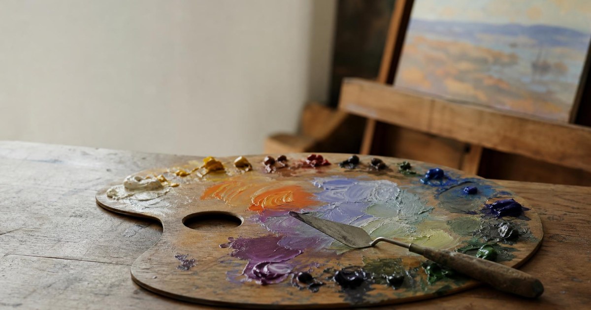
Mix with a palette knife in the open center of the palette. Pull small amounts inward from the piles around the edge so your tube colors stay clean. Atelier painting students keep the center clear for this reason, and it gives you room to compare one mixture against the next.
Test the swatch beside the subject. Hold the knife up to what you are painting, or dab a small patch on the edge of the canvas, and judge the match in context. Colors change next to their neighbors, so a mix that looks right on the palette can look different in place. Adjust and test again.
Finally, note what went in. Write down the colors and rough proportions, such as three parts yellow ochre to one part red, so you can repeat the mix next week.
Every pigment you add absorbs more light, so a mixture loses chroma and drops in value with each color you stir in. Two-color mixes stay the cleanest. Three colors give duller results, and four or more drift toward a gray-brown. Choosing the right pair at the start keeps your mixes alive.
Mixing Complementary Colors to Neutralize, Not Muddy
Complementary colors sit opposite each other on the wheel: red and green, blue and orange, yellow and violet. Each pair holds all three primaries, because green is made of blue and yellow and red completes the set. When the two meet in a mix, they cancel each other's saturation. A touch of green lowers the intensity of a red. More green gives a gray or a brown, and the balance decides the lean. More orange gives a warm brown, and more blue gives a cool gray-blue.
Mud comes from an unplanned mix, where all three primaries get stirred together with no direction until the result turns dull and lifeless. A beautiful neutral comes from two complements mixed on purpose, in proportions you chose, and it keeps a clear temperature. Every painting needs these quiet neutrals. They sit in the shadows, the backgrounds and the clothing, and they make the saturated notes look brighter by contrast.
Darkening works the same way. Black can deaden a mixture, so many painters reach for a complement or a deep earth color to go darker. Ultramarine blue with burnt sienna makes a rich dark that you can tip warm or cool by changing the ratio. The result keeps more life than a mix pushed down with black.
Complements also work as a pair on the canvas. Placed side by side, they make each other look brighter, so a small stroke of orange beside a gray-blue glows. Painters use this effect to make a focal point stand out from a quiet surround.
Mixing Skin Tones That Look Alive
Skin color varies widely, so the best approach is a method you can adjust for each sitter. Skin color depends on the balance of two melanins. People who make mostly eumelanin tend to have darker skin, and people who make mostly pheomelanin tend to have light skin, often with red or blond hair and freckles. No single flesh recipe covers that range, which is why you build each mix from a base that matches the person in front of you.
Begin by choosing a base earth color that matches the sitter's undertone. Yellow ochre or raw sienna suits many lighter complexions. Burnt umber or a transparent oxide suits deeper ones. Mix the base with white to make a foundation, a pile of skin-like color that you will tint from there.
Tint the foundation with small amounts of other colors. Red adds blush and warmth, yellow adds glow, and blue or green cools and grays the mix. Add each in tiny touches, because skin sits in a narrow range and a large change tips it into pink, orange or green.
Before you chase detail, mix two big piles: one average color for the lit side and one for the shadow side. These two piles set the structure of the face. Once the light and shadow are in place, you can break each into smaller steps for the planes.
Chalky or muddy skin usually comes from a temperature or value error. White cools a mix as it lightens it, so a light passage loaded with white turns chalky until warmth goes back in. A muddy shadow often means the temperature is off for the light in the room. When the light is warm, shadows tend to lean cooler, and when the light is cool, shadows tend to lean warmer. Adjusting the temperature fixes more skin problems than changing the hue.
Skin also picks up color from its surroundings. A red shirt throws warm light under the chin, and green foliage tints the shadow side of a face. Look for these reflected notes and add a small amount of that color to the shadow pile. They tie the figure to its setting and make the skin look alive.
Three Exercises That Build Color Sense
These three exercises take an hour or less each, and each one leaves you with a reference you can use again.
A Color Mixing Chart
Draw a grid and label the rows and columns with the colors on your palette. Mix each color with every other color and paint a small square at each crossing. Keep the chart beside your easel. It shows what your own paints do, including the dull greens and the surprisingly clean violets, and it saves guesswork on later paintings.
A Value Scale
Paint a strip of nine even steps from black to white. Then take a tube color, such as yellow ochre, and mix it to match each step. The exercise trains your eye to see value separately from hue, and it shows you how much each pigment shifts as it gets lighter or darker.
Complementary Swatches
Choose a complementary pair, such as ultramarine blue and burnt sienna or red and green. Mix them across a strip, from pure color A through gray to pure color B. Then add white to each step to make a second row. You will see the whole family of neutrals that two colors can make, and you will see how the lean shifts from warm to cool along the strip.
Learn Color at the Easel
Color is learned fastest with a teacher at the easel, someone who can point at your swatch and tell you what to change. At Atelier School of Art in Royal Oak, MI, Atelier Painting is open to all levels, including beginners, and instructors guide each painting step by step, from guided exercises to independent projects. Classes are kept to about 10 students, so every painter gets plenty of one-on-one attention.
Painters who do not own a kit can join the optional Materials Plan, which supplies a canvas along with paint, brushes, a palette and mediums, so you can show up and start mixing.
You can look through the class catalog and register for classes when you find a time that fits, or reach out to tour the studio and see the easels first.